Saul Bass: Finding the intersection of film and design
By Kayla Krurnowski
Saul Bass was an American Graphic Designer known for his poster and title sequence designs, as well as an Academy Award Winning Filmmaker
Where He Started
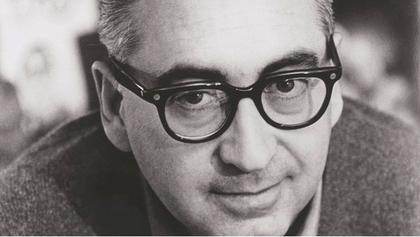
Saul Bass was born in the Bronx, NY on May 8th, 1920. Even from a young age, it was noticed by the adults in his life that he was drawn to creativity and loved to draw. After graduating from high school, he pursued this creativity and studied at the Art Students League in New York City, and eventually went on to push his studies further at Brooklyn college1. In 1946 he moved to Los Angeles, which would set Bass on the track for the rest of his career.
Early Design Career
After college, Bass began work as an Advertising Designer. It wasn’t until a decision to move to Los Angeles in 1946 that took Bass’s career to new levels. When he first arrived in Los Angeles, he continued to work for advertising agencies, and he got his first “big break” in 1954. This came from the design he created for director Otto Preminger’s 1954 film Carmen Jones 1. The group of people making the film were so incredibly impressed with Bass’s poster design that they asked him to also create the title sequence for the film1. This decision would set Bass on a path for his career that would eventually bring him to gain the title by many of one of the greatest designers in the history of design. This decision would also open eyes to the possibility of incorporating principles of design and graphic design into films. One year after Carmen Jones was released, Bass designed the poster for Preminger’s next film The Man with the Golden Arm . This was the piece that made Bass become known by most people in the design industry, and his career was only just beginning to take off.
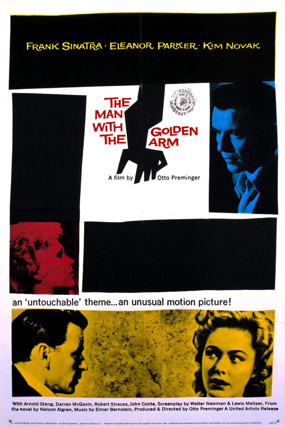
Bass's design for Preminger's
The Man with the Golden Arm8
Logos and graphic design work

Bass's design for AT&T
2Though he is mainly known for his work on film poster and title sequence designs, Bass has also had an extraordinary career in other sectors of graphic design. He has created some of the most iconic brand marks and logos in graphic design. His logos were specifically known for having a very long lifespan, averaging around 34 years. This is incredible , given that the average lifespan of a regular, well-done, professionally designed logo is around 10 years3. One of his oldest designs is the brand mark for Kosé Cosmetics, which has not been changed since Bass first designed the piece in 1959. Bass also created the iconic brand mark for the Girl Scouts of America, which had minor modifications made in 2010, though the overall design remained the same. Other iconic logos and brand marks created by Bass are Kleenex (1980s), AT&T (1986), and Warner Communications (1972).

Bass's logo for Girl Scouts of America
2
Posters and Title Sequences

Bass's poster for Hitchcock's
Vertigo8Bass’s design career was truly defined by the posters he created for films and the design of the title sequence of those films. After his work took off in 1955 with his design for The Man with the Golden Arm, Bass began to work with some of the most iconic directors of this period, and even some of the most iconic directors ever. Some of his best known work from this period was made in collaboration with iconic horror director Alfred Hitchcock. With his posters and sequences for Hitchcock, Bass developed his signature “kinetic type” that would move across the screen and incorporate images into the text 2. In these title sequences, Bass was able to create a type of brand recognition for the films. There would be consistency between the poster and the title sequence of the movie. Bass title sequences also often would set a tone for the film the viewer is about to watch. Perhaps the most iconic of Bass’s designs, and arguably one of the most iconic title sequences in design, Bass’s title sequence for Alfred Hitchcoks 1960 masterpiece Psycho contains intense music with text flying in, with lines cutting through the screen and through the text, which one can see as mimicking the intense stabbing and slicing that happens so frequently throughout the film. The sequence ends with the text directly leading to the setting of the movie, which is just one example of Bass’s kinetic type. This kinetic type is best seen in the North By Northwest title sequence, where horizontal lines fly in the screen over the type and eventually make the windows of the building the opening scene is set in. It was in 1955, when Bass would meet a woman by the name of Elaine Makatura, that set the path for the rest of his life. Makatura came to work with Bass on these designs and served as the co-director as some of the films he was designing for. In 1960, Elaine Makatura and Saul Bass were married, and much of Bass’s work after this was in collaboration with Makatura1.
Later Life
After Elaine Makatura and Saul Bass were married, most of their work was collaborative. In the late 1960s, the couple had their two children, which eventually brought them to the decision to focus on their family. But, this did not get in the way of their career and their success. The couple began to move away from title sequence design and started to shift their lens to an even broader scope by entering the world of filmmaking as a whole6. In 1968, the Basses directed a short film titled Why Man Creates. Both Saul and Elaine Bass received Academy Awards for this under Best Documentary (Short Subject). Bass also directed the 1974 Science Fiction film Phase IV1. It wasn’t until the late 1980s that Bass got back to his roots and started creating title sequences again. Martin Scorcese, best known for his films about the Italian mafia, was the director who got Bass back into title sequence design, and the Basses designed the opening sequences for some of Scorcese’s most iconic films such as Goodfellas(1990), Cape Fear(1991), and Casino(1995), the couple’s last sequence design6. Bass died in 1996 after suffering from non-Hodgkin's lymphoma at the age of 75. His legacy is carried for creating the iconic style of title sequences of the 1950s and many title sequences pay homage to his style, including the title sequences for Catch Me if You Can(2002) and the television series Mad Men(2007-2015)8.
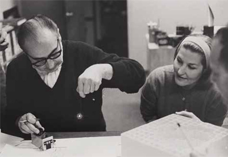
Saul and Elaine working on a special effect together, 1967
4 “I want everything we do to be beautiful... It’s worth it to me. It’s the way I want to live my life. I want to make beautiful things, even if nobody cares.”
-Saul Bass
Sources
1. Bauer, P.. "Saul Bass." Encyclopedia Britannica, May 4, 2020.
https://www.britannica.com/biography/Saul-Bass".
2. Bigman, Alex. “Saul Bass: The Man who Changed Graphic Design” 99 Designs, 2012.
https://99designs.com/blog/famous-design/saul-bass-graphic-designer-of-a-century/
3. Balkon, Melissa. “What is the Lifespan of a Logo?” Strong Design, October 10, 2012.
4. "Elaine Bass." Art of the Title. Accessed March 31, 2021.
https://www.artofthetitle.com/designer/elaine-bass
5. MovieTitles. "Saul Bass: Psycho (1960) Title Sequence." YouTube. October 30, 2017. Accessed March 31, 2021.
https://www.youtube.com/watch?v=aj6aBuC1Lb8.
6. "Saul Bass." Art of the Title. Accessed March 14, 2021.
https://www.artofthetitle.com/designer/saul-bass/.
7. "Saul Bass Short Film Why Man Creates." YouTube. January 31, 2018. Accessed March 31, 2021.
https://youtu.be/CeAHOVcWvoc
8. "Saul Bass." Wikipedia. March 22, 2021.
https://en.wikipedia.org/wiki/Saul_Bass